With only a few days left before the Improv Block of the Month starts, I figured it’s time to make some decisions.

That said, I’ve decided to go with my first idea: use some bright, happy colors. This is something I rarely do in improv, despite loving them. I tend to default to my tried-and-trusted neutrals/low volume colors.

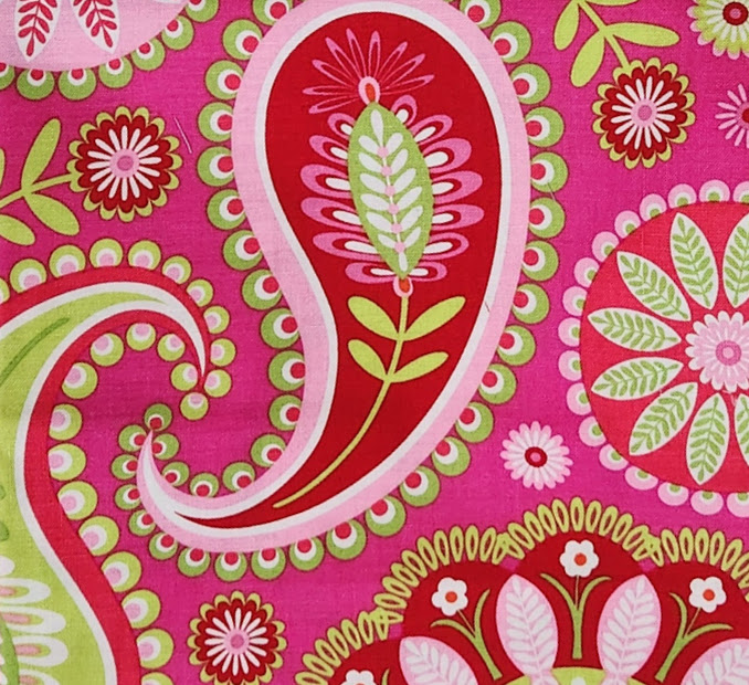
So, to make sure that I didn’t slide back into the neutrals, I chose a fabric with almost no neutral colors. (I’m going to improv that white and pretend it’s a light pink.) This might get interesting. Or loud. Or just out of my league. But here we go! I started with this pretty, very bright fabric of flowers and paisley designs. It screams happy, so we’ll see what I can do with it. I don’t have much of it, probably less than a fat quarter, but if the last quilt is any indication of my needs, this should be plenty. I’m going to try to use more of the print. And I’ll try to make larger pieces or blocks. The last quilt, which is isn’t finished, has small and smaller, pieces and took forever to put together.

Since this fabric has the red background on some of the paisleys and mandalas, red was my first pull. I simply found lots of reds that could almost be the same, then weeded out the ones that were too tomato-like or too dark. I figure I need at least a few colors. Is it improv if there are no choices to be made?

The pinks were a little more difficult. There are so many pinks in my stash and most seemed to be right. Somehow, I managed to limit myself. However, I did leave a few of the iffy ones (on the side) in case I wanted more options! Like I need them, right?

Finally the greens. This print has every day, normal green then moves ever closer to lime or even yellowy green. I decided at that point to stay close to the matching greens. If I’m going to venture away from the “correct” color palette, I’ll let the pinks speak. Otherwise, the reds and greens have to take a back seat. Surely, something has to take a back seat. Of course, for me, “back seat” doesn’t necessarily mean silent or even quiet. In this case it simply means I’m going to try to limit myself. (Ha!) So, in the end, I have greens that are close in hue to the print.

And there we are! One hefty print and a variety of “coordinating” colors. Notice that I have a few tone-on-tone fabrics, especially in pink, plus linen and homespun. It want more than just color. I also want depth and texture in this quilt. Hopefully, I have a good variety without too much noise. I guess we’ll see.
Once you’ve chosen your color palette, come back here and post a picture in the comments. I’d love to see what you’re working with! Also, ask questions if you have any. And, if you’re struggling with choices, post pictures and the rest of us will “advise” you.
Have a lovely Christmas, everyone!


Thanks, Sandy. I’m thrilled that you’re participating and hope you’ll post a picture of your fabrics when you choose them.
Mary
Oh Mary, those fabrics are so pretty! I can’t wait to see what you’re going to do with them. Makes choosing my own fabrics a little easier.
Sandy